Design is at the core of everything you do.
The piece of hardware you are using to read this post has been designed.
The website you read is the result of a design process.
Design is about creating the experience that will allow your audience to enjoy from what you want to give them.
As a kid you’ve designed carefully this present for your mum on mother’s day.
As a teenager you designed your outfit/personal image to fit in the way-too-harsh world of highschool…
As long as you’ve cared about something you did your best, and it came out some way. It didn’t always work but you’ve learned from it and moved on.
Poor design
Poor design happen when we look for a shortcut. Something that can sorta ass the job but not quite.
Something “that’ll be good enough for now.”
And it is ok. Sometime a business need shortcut. Deadline are real. Your customers’ experience can wait.
It is true. But it is dangerous.
It is like when poor management decision become normal in an organisation, you just create an horrible culture for your company.
Poor decision happen from time to time in an organisation, and you cannot micromanage your team leaders, so everyone can survive for an other day.
But when it becomes the day to day of your company, the best people will leave, and inner politics will start to cripple the core of your organisation. So you try to fix it.
Same for your product & communication design habits.
If you keep doing what’s easy instead of what’s right, you will lose customers, and you will damage your reputation. It is a game you will lose in the long run.
Examples
No need to go very far.
We all browse the web, and stumble on these every single day.
Example 1: Sliders
Sliders don’t help end users.
It’s common knowledge.
0.11% of your audience will ever click on anything that is not the first slide. (Actually just 1% is expected to even click on this slide).
Yet, we still see them everywhere.
Why?
Because it was the easier not to make a decision to answer the following question: “What should be the first thing your visitors will see when they open the site?”
So you chose this abomination from a forgotten past.
While a you know it is just a bad idea…
And even without having the top designers telling you that on every venue available (like here, or here), you could have know for youself by simple reverse engineering your own personal experience.
You know you do not pay that much attention to these massive sliders, what you do? You just go to the next thing on the site.
So why expect something else people browsing your own website?
Example 2: Modal Marketing Popup
Popup are evil since the beginning times.
Popup blockers were the first thing we invented to block spammy popup everywhere on our computers.
Today, we have this fancy thing called a modal popup.
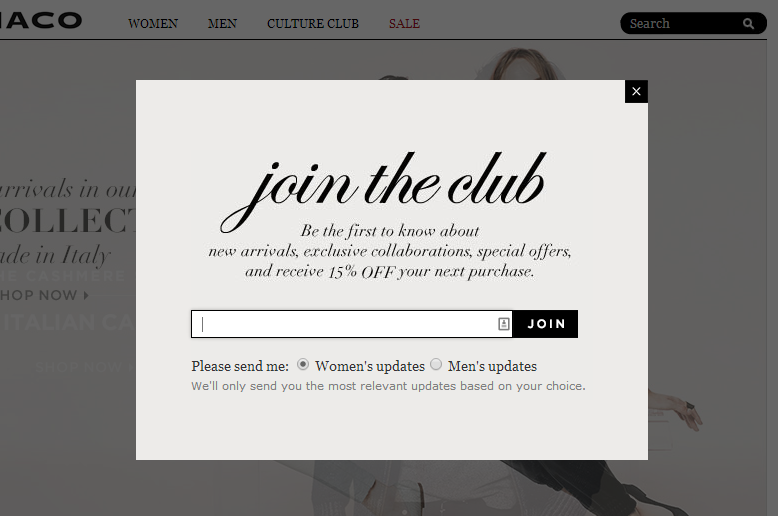
Ah, and for those who don’t know what I am talking about a modal popup look like this one:

missing image
It usually will popup after a few second spent on a website, and shamelessly asking for you to:
- Signup to a newsletter
- Buy something
- Download something
So while all these things (newsletters/downloads/purchases) are totally ok in itself, how dare you interrupting, like a total jerk, the person reading your site right now.
If you took the time to put content there (on your site that it) and you expect it worth other people’s time, let them read it, FFS!
And if what you say in your popup is sooo vital and sooo important, then please, make it the first content item on the page. You don’t need to go full screen modal on your audience.
What is the point to harass your user with useless crappy gimmick that probably won’t convert anyway…
Be logical and pragmatic. The fact that you can technically do it, doesn’t mean you should.
Think about your users, about what they think when they see you annoying design choice… Designing is making decisions on how people will interact with your product or with your site. It’s not a buzzword. It is the essence of the delivered experience and therefore, it shapes the perceived value to its core.
So, lets wrap it up:
We now know that sliders and unwarranted modals are to be use with care. (while that wasn’t the point of the article, I very much wanted to say this.)
But it goes far beyond some web usability.
Design is a core activity for every entrepreneur, business person, and everyone who is creating something to be used by other people. Be it a service, a product, an organisation.
What you do influence other people’s life.
Design should therefore embed the will to serve other people for their best interest. Because in the end, it is what is right, not necessarily what is easy, that matter.
Still don’t believe me. Read on.
How designers destroyed the world
I didn’t say it. That’s the title of Mike Monteiro talk. Watch it.